How Performance Marketers Can Create Stunning Data Visualizations: A Step-by-Step Guide
Data visualization is an essential tool for performance marketers, enabling them to convey complex information in a clear and engaging manner. With the increasing volume of data available to marketers, the ability to present it in a visually compelling way has become more important than ever. Whether you’re analyzing campaign performance, tracking customer behavior, or presenting key performance indicators to stakeholders, creating stunning data visualizations can help you make better decisions and drive better results.
In this blog post, we will provide a step-by-step guide for creating data visualizations that make an impact. From selecting the right design elements and tools to transforming raw data into meaningful insights, this guide offers actionable tips and best practices for anyone looking to create visualizations that grab attention and communicate information effectively.
How Performance Marketers Use Data Visualization in 2023
Performance marketers are utilizing data visualization in 2023 to drive their campaigns and use data to drive decisions in several ways. Let’s dive deep into the latest tools, techniques, and trends that performance marketers are leveraging to make their marketing analytics more efficient and effective.
Visualizing key metrics
With clear visual representations, marketers can instantly grasp and analyze key metrics such as conversion rates, click-through rates, and ROI. These visualizations provide a comprehensive overview of campaign performance, enabling marketers to identify areas of improvement and take appropriate action.
Visualizing return on investment (ROI)
Performance marketers need to calculate and track the ROI of their campaigns. Data visualization makes it easier to comprehend complex financial metrics related to campaign performance. Marketers can create visualizations that illustrate the relationship between ad spend and revenue generated, enabling them to optimize their marketing budgets and ensure a strong ROI.
Attribution modeling visualization
Attribution modeling is crucial for understanding the impact of various touch-points on a customer's journey. Data visualization tools assist performance marketers in visualizing complex attribution models, making it easier to identify the most influential touch-points and allocate resources accordingly. These visualizations enable marketers to optimize their campaigns and achieve better attribution accuracy.
10 key data visualizations for performance marketers
There are some key data visualizations that every performance marketer should know and utilize. From customer segmentation to geographic heatmaps, we will break down these visualizations and explain how they can help you gain valuable insights, optimize your strategies, and ultimately maximize your performance marketing efforts.
- Sales funnel visualization
Every customer goes through a process before making an actual purchase. Businesses must be able to see and understand this process before they can optimize the path to a final sale. Sales funnel visualization helps marketers represent the different stages of the customer journey, from initial awareness to final conversion. It helps marketers identify the drop-off points and optimize their marketing efforts at each stage.
- Customer segmentation
Most businesses appeal to more than one customer segment. Marketers must understand how these customer segments are similar to each other and how they are different.
A visualization that groups customers into segments based on characteristics such as demographics, behavior, or preferences is called a “customer segmentation visualization.” This helps marketers understand their target audience better and tailor their marketing strategies accordingly.
- Social media engagement
Social media has become an indispensable arrow in a marketer’s quiver. Its ubiquity and popularity means that simply observing social media engagement can give marketers greater insights into their target audience’s likes, dislikes, interests, and trigger points.
Visualizations of social media metrics, including likes, comments, and shares of posts, as well as follower growth, provide insights into the effectiveness of social media marketing campaigns and help track engagement and brand awareness.
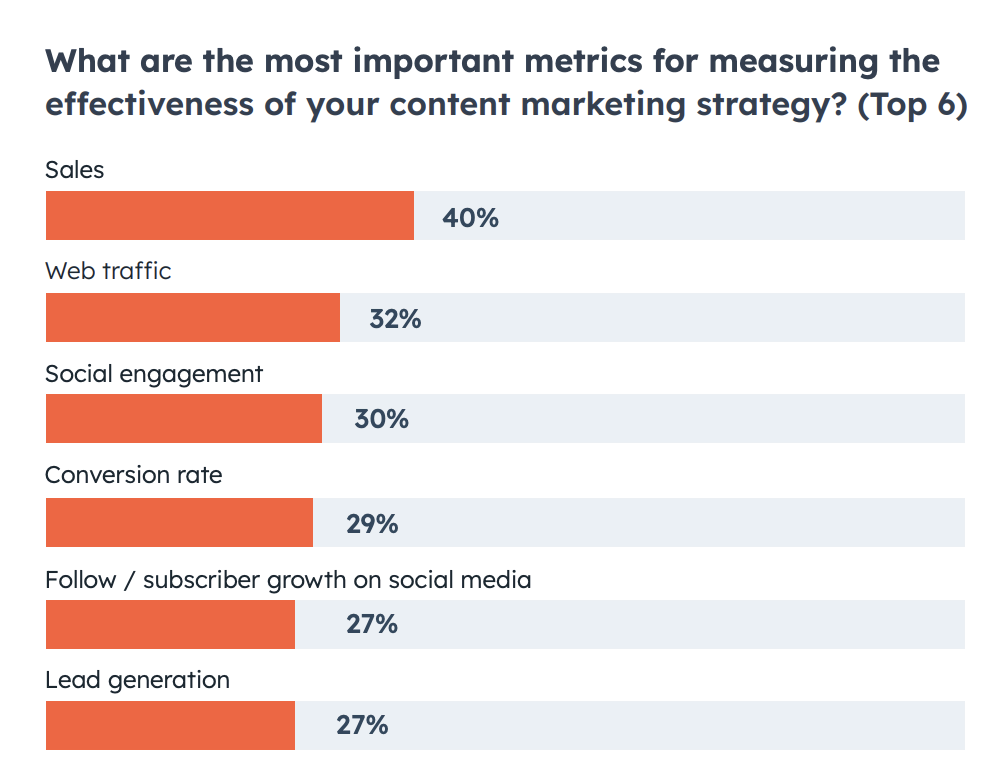
- Website traffic and behavior
Almost one-third of marketers consider website traffic to be the most important metric that they monitor. Visualizations of website analytics metrics like page views, bounce rates, time on page, and conversion rates provide insights into website performance, user behavior, and areas for improvement in marketing campaigns.
- Email campaign performance
Visualizations of email campaign metrics, such as open rates, click-through rates, and conversions help measure the effectiveness of email marketing efforts and identify trends and opportunities for optimization.
- Customer lifetime value
A visualization that shows the value of a customer over their entire relationship with a brand helps marketers understand the profitability of different customer segments and focus their marketing efforts accordingly.
- Advertising performance
Visualizations of key advertising metrics like impressions, click-through rates, and conversions help marketers evaluate the performance of their advertising campaigns and optimize their allocation of advertising budgets.
- Market share visualization
Performance can often only be fully understood when placed in the context of an entire industry. A business can be profitable while lagging behind its industry counterparts. A market share visualization that compares the market share of different brands or products within a particular industry provides insights into brand performance relative to competitors and market trends.
- Geographic heatmaps
Visualizing data on a map helps marketers understand regional customer behavior, preferences, or market penetration. It can assist in localizing marketing campaigns and targeting specific regions or demographics.
- Competitor analysis
Visualizations that compare key metrics, such as market share, customer satisfaction, or social media engagement, between a company and its competitors help marketers understand their competitive position and identify areas for improvement.
How to Transform Raw Data Into Meaningful Insights
For modern businesses, collecting raw data alone is not enough. To derive value from this data, it needs to be analyzed, interpreted, and transformed into meaningful insights. In this section, we will explore the process of converting raw data into actionable insights that drive better decision-making.
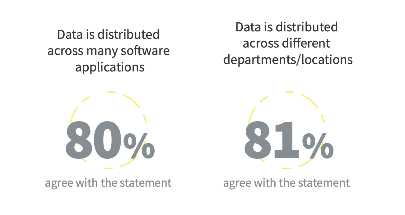
Collate and analyze your data
Businesses generate a staggering amount of data — but this information is not always easily accessible due to the way it’s stored and shared. An industry survey revealed that 80% of businesses say their data is stored across different software applications and 81% believe that their data is stored across different departments.
To overcome this challenge, businesses should start by thoroughly understanding the raw data they have and creating a single source of truth. Once that’s done, marketers must identify the variables and ascertain their relationships and any patterns or trends within the data.
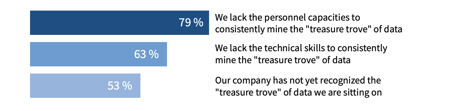
Utilize automatic data visualizations to increase efficiency
On the surface, creating data visualizations can seem extremely time and labor intensive. Recent research has shown that 79% of companies believe that they lack the personnel capacity to consistently mine their data effectively.
However, once your front- and back-end data are housed on a single platform, you can explore features such as automatic data visualizations to populate charts and simplify the process from data gathering to data utilization.
Choose the right visualization type
Select the visualization type that most effectively represents the data and aligns with your goals. Common types include bar charts, line graphs, pie charts, scatter plots, and maps.
Clean and preprocess the data
Clean and preprocess the raw data to remove any errors, missing values, or outliers that might affect the accuracy of the visualization. Perform necessary calculations, aggregations, or transformations to prepare the data for visualization. MarinOne software allows businesses to populate data without worrying about human error.
Tell a story
Craft a narrative or story around your data to make it more engaging and relatable to the audience. Develop a logical flow that leads the viewer through the visualization, highlighting key points and insights.
How MarinOne can help performance marketers visualize data better
MarinOne enables marketers to easily access and analyze their data, with customizable dashboards that can be tailored according to their specific business needs. The platform allows marketers to visualize their campaigns' performance through easy-to-read graphs, charts, and tables, empowering them to identify trends, insights, and areas for improvement.
With MarinOne, performance marketers can:
- Consolidate their advertising data across different channels into a single dashboard, allowing them to get a comprehensive view of their marketing efforts and identify cross-channel trends.
- Get real-time campaign tracking by integrating with sources like Google Analytics and Adobe Analytics.
- Create custom reports using an intuitive drag-and-drop interface, allowing them to report on the metrics that matter the most to them.
- Optimize their campaigns with data-driven insights by using MarinOne's AI bidding and Optimization Insights features, which provide recommendations to improve campaign performance.
- Collaborate with their team members on reports or dashboards and share them easily with stakeholders using MarinOne's collaboration features.
Furthermore, MarinOne's platform integrates with leading third-party data visualization tools like Tableau and Domo, allowing marketers to create stunning visualizations and stories with their data.
MarinOne provides a suite of reporting and analytics tools that can help performance marketers consolidate data, track campaigns, create custom reports, and optimize campaigns. By empowering marketers with visual and data-driven insights, MarinOne can help marketers improve their performance and drive better results.
To get started, schedule a live, personal demo today.